FREELANCE
FREELANCE
Independence4you
My client, a therapist, was seeking a full rebrand of her personal practice. Her main concerns were that her existing website felt outdated, difficult to navigate, and lacked functionality for online bookings. Since she wasn’t attached to any elements of the current brand, she gave me full creative freedom to deliver a complete rebrand.
Original DesignCombination of contrasting colours don’t feel ‘timeless’. They lack a professional tone which don’t compliment the industry.
The gradient feels overwhelming as it is repeated in the background and the puzzle. The choice of colours don’t blend naturally.
Drop shadow feels harsh against the brighter colours, there is also no consistent direction for them behind the puzzle and text.
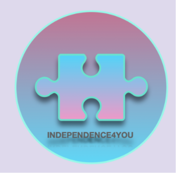
It is unclear which industry the logo represents as the name ‘Independence4you’ is ambiguous. It could come across as more corporate to a client rather than personable.
The puzzle icon symbolises problem-solving, finding the ‘missing pieces’, or bringing clarity which ties well to the therapeutic process.
The word-number combo feels less polished / somewhat outdated. Research has demonstrated that many industries, especially professional services like therapy, lean toward simple, trustworthy wordmarks that feel timeless.

REBRAND
REBRAND
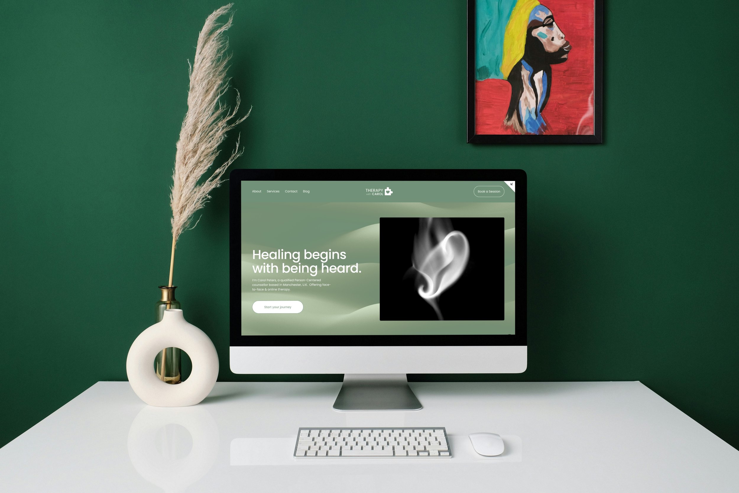
Logo

Flexible design system
Stripping back the colours gives room to create a calming, adaptable palette for the website and other brand assets. It avoids locking the brand into a dated or overwhelming aesthetic.
Visual symbolism
The puzzle piece is a recognizable symbol in therapy and personal development so we were keen to keep it. By softening it, I kept continuity with the old identity while making it less clinical and more approachable.
Future-proofing
The simplified identity can be easily scaled across print, digital, and social media while maintaining consistency.
Clarity of service
Before: “Independence4you” was ambiguous—didn’t instantly communicate therapy.
After: “Therapy with Carol” is clear, personal, and approachable. It positions Carol as the face of her practice and builds trust right from the name.
Personality and connection
Using the clients name humanises the brand. In therapy, the relationship between practitioner and client is key, so this reinforces a sense of warmth and authenticity.
Colour Palette
My client’s original website lacked a structured colour palette, so I developed one using calming shades of green complemented by monochrome tones, chosen to reflect the therapeutic and professional nature of her practice.


Low & high fidelity wireframes

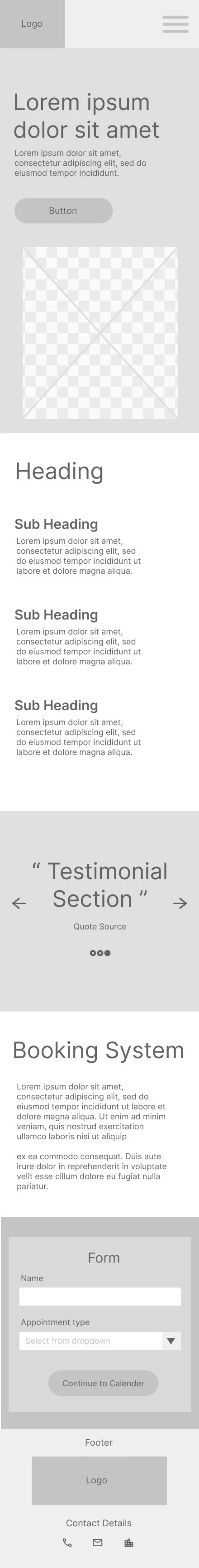


Clear Navigation
Consistent colour scheme
Visible booking system
Clean layout
Website in action
This is an ongoing project.